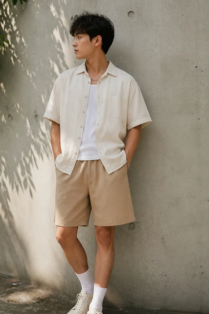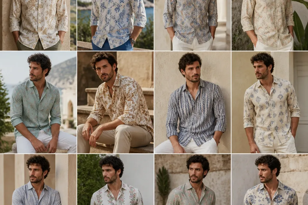
1. Navy Micro-Dot Linen Button-Down
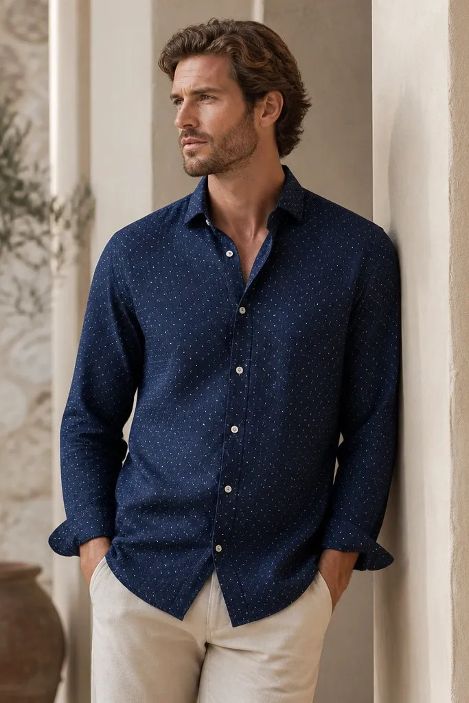
Micro-dots read sharp because the pattern doesn't fight your body shape. Navy linen also hides creasing better than light colors, and it stays flattering when you're in direct sun. The white dots brighten the shirt without looking loud, so it works both buttoned and half-open. This is the printed linen option I reach for when I want "summer clean" instead of "festival outfit."
Wear it with beige or sand chinos and a belt in tan or cognac. Keep the shirt fit regular through the chest, not tight - linen needs room to move. If you're unsure about the print, this one is the safest because the dots are small and consistent.
Pro tipRoll sleeves once to show a clean forearm line - two folds max. If you tuck it, do a partial tuck so the dot pattern stays visible at the waist.
AvoidAvoid pairing it with other navy pieces that have texture like seersucker; it can make the look feel heavy.
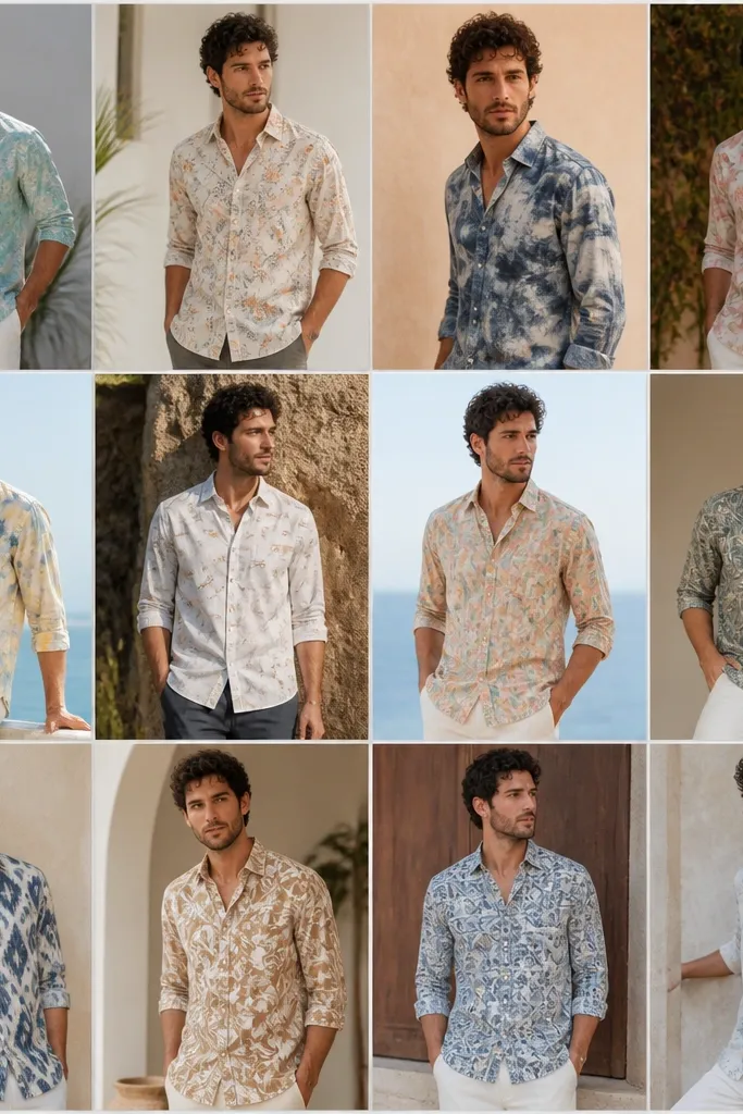
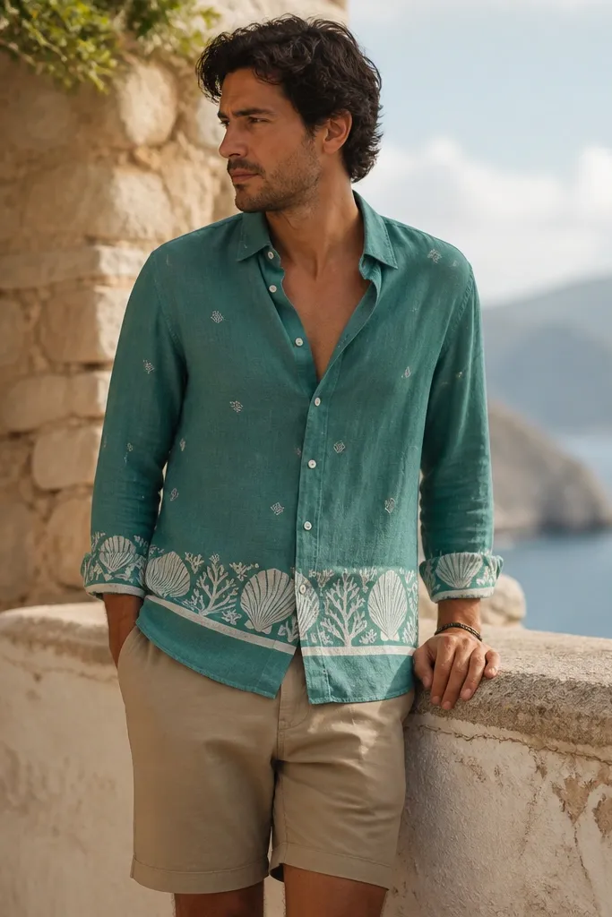
2. Seafoam Floral Linen Overshirt
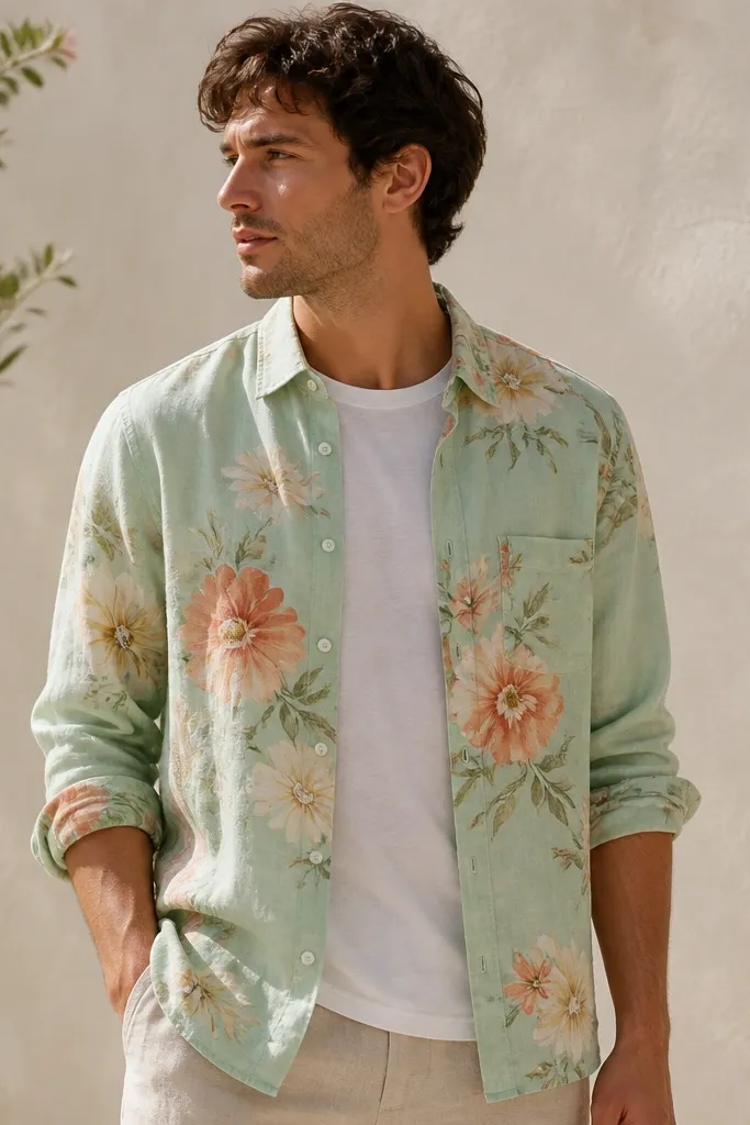
Seafoam is a color that looks expensive when it's slightly faded, and linen gives it that natural softness. The watercolor floral print stays airy because the colors are close to the base tone, not high-contrast. Wearing it as an overshirt gives the print breathing space and keeps it from overwhelming your torso. I like this for days when the heat is high but you still want a "styled" look without trying hard.
Layer it over a white crewneck or a very light blue tee. Use off-white trousers or cream shorts and keep your footwear simple - white sneakers or tan leather sandals. The overshirt should hang to mid-hip, not past the thigh, or the floral print looks like a costume.
Pro tipChoose one flower color (peach or pale yellow) and match it in a watch strap or a small accessory tint.
AvoidSkip high-contrast bottoms like black denim; seafoam floral needs lighter neutrals to stay fresh.
3. Terracotta Block Print Linen
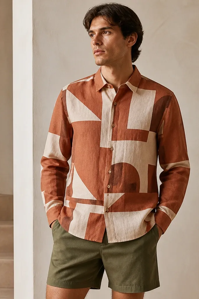
Geometric block prints look modern on linen because the fabric's texture adds depth to straight shapes. Terracotta warms up your whole outfit and looks great against olive, sand, and cream. The off-white blocks keep the shirt from reading too heavy, even if the print is strong. This one is for when you want the shirt to feel like the main character.
Wear it with olive shorts or sand trousers and a belt in dark brown. Keep the shirt buttoned at least to the second button if you want a cleaner line. The fit should be regular through the shoulders - block prints look best when the shirt doesn't pull.
Pro tipAdd a thin gold chain or a simple watch face; the warm tones make metals look intentional.
AvoidDon't pair terracotta block print with bright red shoes; the colors start competing.
4. Black-and-White Stripe Print Linen
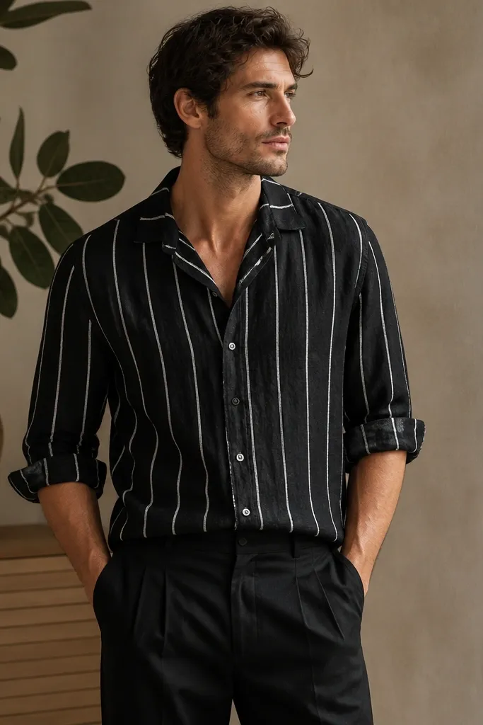
Stripe prints are the easiest way to look sharper fast because they create a vertical line. On linen, the stripe pattern looks crisp and graphic, especially in black-and-white. This is a good option if you want printed linen but you don't want color overload. I wear this when I'm going somewhere casual-but-dressed, like a patio lunch or a summer date.
Pair it with black trousers or dark navy shorts and keep the rest monochrome. If you're tall, choose a longer hem so the stripes keep their line from chest to waist. If you're shorter, avoid an extra-long shirt - it can bunch at the hips.
Pro tipPress the collar with your hands before you leave - linen creases are fine, but a flopped collar makes stripes look sloppy.
AvoidSkip loud patterned shorts with this; the stripe print already carries the visual weight.
5. White Linen with Indigo Tie-Dye Wash
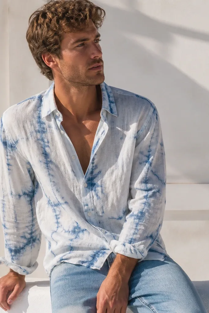
This style works because it's not a full tie-dye explosion - it's a wash effect that looks sun-faded. White linen keeps you cool, and the indigo swirls add movement without looking busy. The irregular pattern hides small wrinkles better than solid white. It's casual in the best way: beachy, but not sloppy.
Wear it with light blue denim or off-white chinos. Keep the collar open to show a plain undershirt if you want a relaxed vibe. Let the shirt drape - don't size up too much or the tie-dye will look like it's hanging off you.
Pro tipFor extra polish, add a woven belt in natural tan and plain canvas sneakers.
AvoidAvoid heavy dark trousers; indigo tie-dye against black can make the whole outfit feel too harsh.
6. Olive Linen with Tan Leaf Print
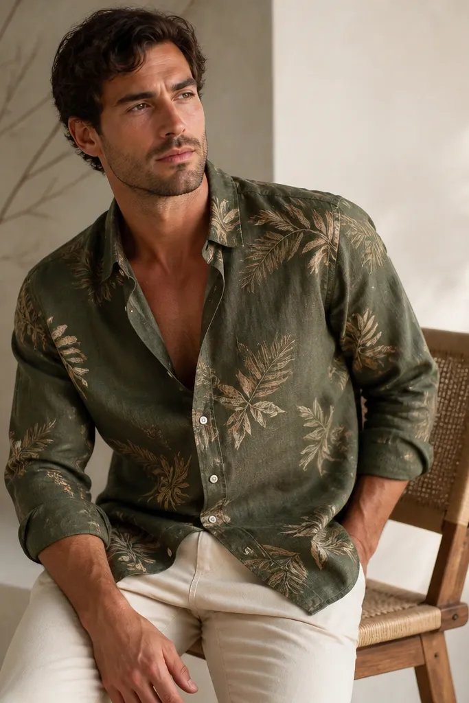
Leaf prints look natural on linen because both have an organic texture. Olive also photographs well in daylight and hides sweat marks better than light prints. The tan leaves keep it earthy, so you don't need loud colors elsewhere. I like this look for outdoor dinners where you want something more interesting than a plain olive shirt.
Pair with cream chinos or light stone trousers. Choose shoes in tan suede or brown leather loafers. Keep the shirt collar clean and the top buttons undone - olive leaf print looks best when you show some neckline.
Pro tipRoll sleeves to around elbow height and keep cuffs neat - leaf prints look intentional when the sleeves are controlled.
AvoidDon't add another green patterned item like a patterned cap; it gets visually crowded.
7. Sky Blue Linen with Navy Paisley Print
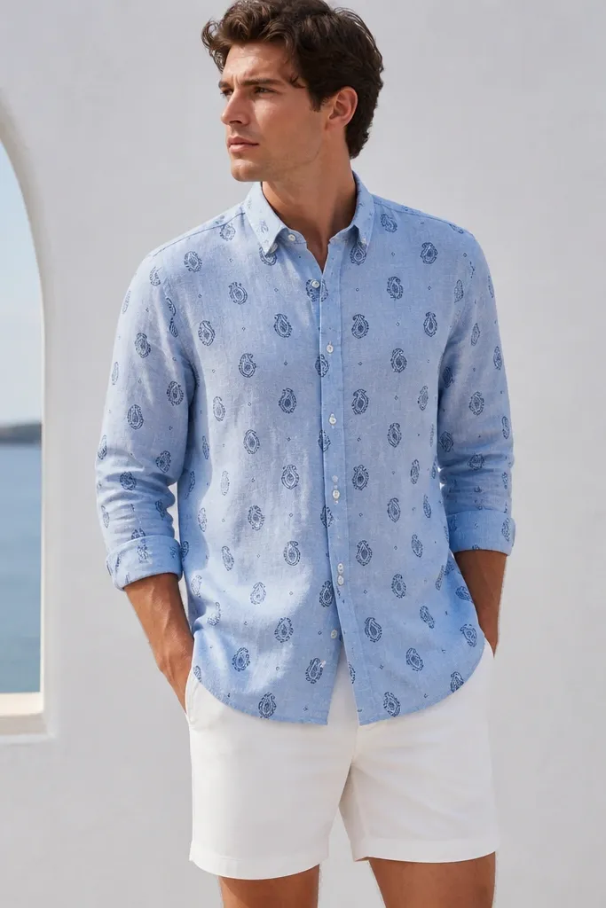
Paisley is one of those prints that can look classy or chaotic depending on scale. On a sky-blue base, navy paisley reads crisp and nautical. Linen makes the print feel relaxed, not formal. This is a great option when you want a pattern that's still "wearable" for normal life.
Wear it with white shorts or light grey trousers and keep accessories simple. If you're wearing it fully buttoned, keep the shirt tucked or it will balloon at the waist. For shoes, go with white sneakers or navy espadrilles.
Pro tipMatch your sunglasses frame color to the navy print - black or dark tortoise works well.
AvoidAvoid pairing paisley with stripes; the patterns fight and the outfit looks busy.
8. Sand Linen with Coral Floral Spray
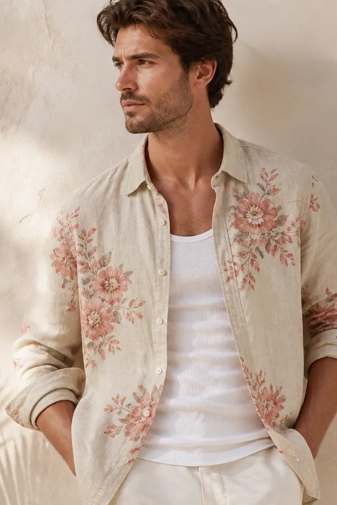
The trick with floral spray is where the print sits. Concentrated clusters on sand linen look like art, not wallpaper. Coral against neutral sand gives you a warm glow that looks good on camera. When you wear it open, the floral clusters frame your chest and keep the look light.
Layer over a white tank or a plain off-white tee. Pair with navy shorts or light tan trousers so coral stays the only warm color. Choose a shirt with a slightly longer hem so it drapes smoothly when open.
Pro tipAdd a simple bracelet or watch in a warm metal tone; coral looks best with gold-ish accents.
AvoidSkip bright lime green bottoms - coral sand florals need calm neutrals.
9. Cream Linen with Black Script Micro-Print
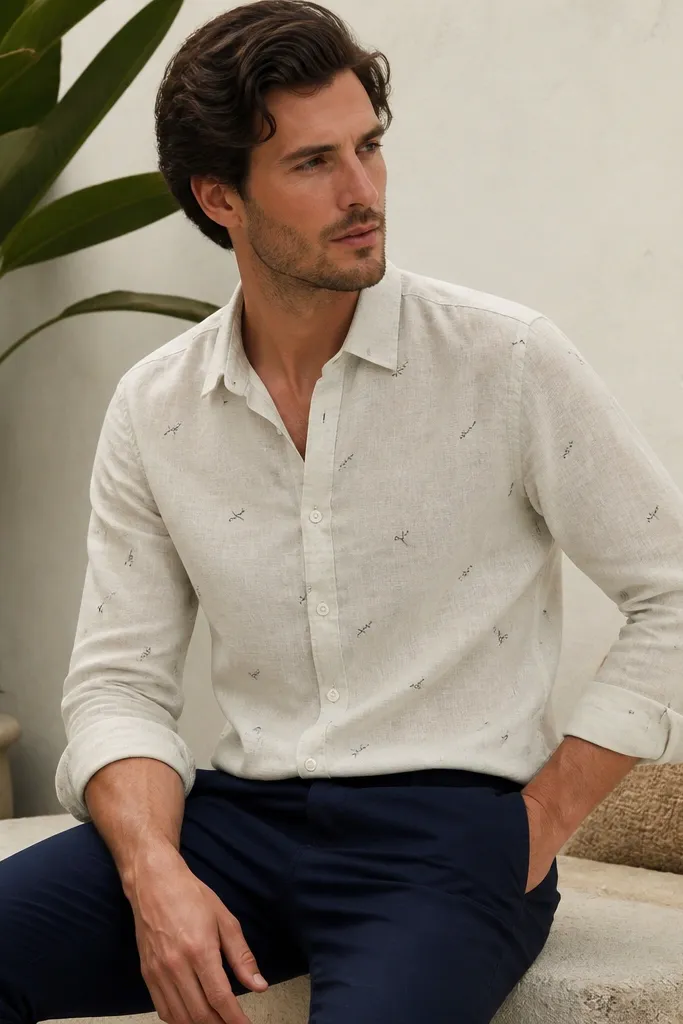
Script micro-print looks cool because it gives texture without big shapes. On cream linen, the black marks show up clean and feel modern. This style works for people who want printed linen but don't want flowers or leaves. It also hides wrinkles better than solid cream because the pattern breaks up the visual lines.
Pair with navy chinos and a black or dark brown belt. Keep the fit regular and avoid a super-slim shirt; linen needs space for movement. If your script is dense, fully button it and wear it like a regular shirt - it won't look like a gimmick.
Pro tipChoose minimal shoes: black leather sneakers or simple loafers to keep the script from competing.
AvoidDon't wear it with a loud printed sock; keep socks solid so the shirt stays the focus.
10. Burgundy Linen with White Oversized Floral
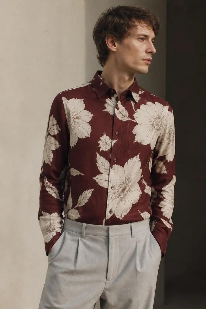
Oversized floral prints pop on darker linen because the contrast is strong. Burgundy also gives you depth in indoor lighting, so the shirt still looks good at night. White florals keep it from feeling too heavy, and linen's texture makes the big shapes look softer. This is a statement shirt that still feels summer-appropriate.
Wear it with light grey trousers or off-white pants to balance the burgundy. Keep the collar neat and don't add another bold color. If you're wearing it open, use a plain white tee so the florals stay crisp.
Pro tipSteam the front panel lightly before you go out - the print lines look best when the fabric sits flat.
AvoidAvoid dark denim; burgundy with dark denim can look like you're dressed for fall, not summer.
11. Teal Linen with White Shell Border Print
Border prints are clever because they give you a visual anchor near the waist. Teal is bold but still wearable, and the white shell motifs bring a coastal feel. The scattered shells keep it playful without making the whole shirt look like a beach towel. I like this for vacations because it looks intentional even when you wear it casually.
Pair with tan shorts and a white tee underneath if you want a light contrast. Choose tan or natural woven shoes and keep the rest plain. The shirt should sit at the hip - if it's too long, the border print drifts and looks off.
Pro tipWear it with a simple ring stack in silver; teal and white look sharp with cool metals.
AvoidSkip patterned swim trunks; if the shirt has motifs, your bottom should stay solid.
12. Black Linen with Pale Blue Marble Print
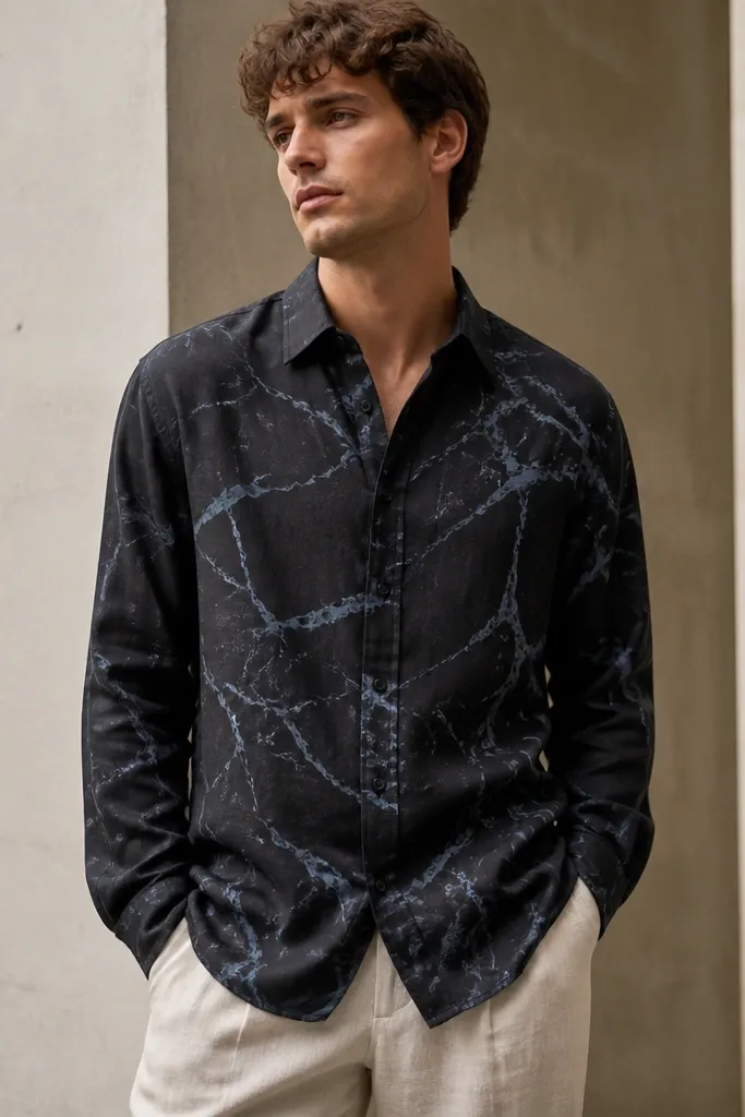
Marble prints look expensive when the colors are controlled. Black linen hides stains and sweat marks, and the pale blue veining adds movement without the loudness of florals. This is a printed linen shirt for evenings too, because the color story stays grounded. It also photographs well because the veining catches light differently than solid fabric.
Pair with light stone trousers or off-white chinos. Add a light belt in grey or dark brown depending on your shoes. Keep the shirt buttoned to at least the second button if you want a sharper look.
Pro tipIf you fold the sleeves, do it once and smooth the fabric - marble prints show creases more clearly.
AvoidAvoid bright white bottoms; the combo can look harsh and flatten the marble effect.