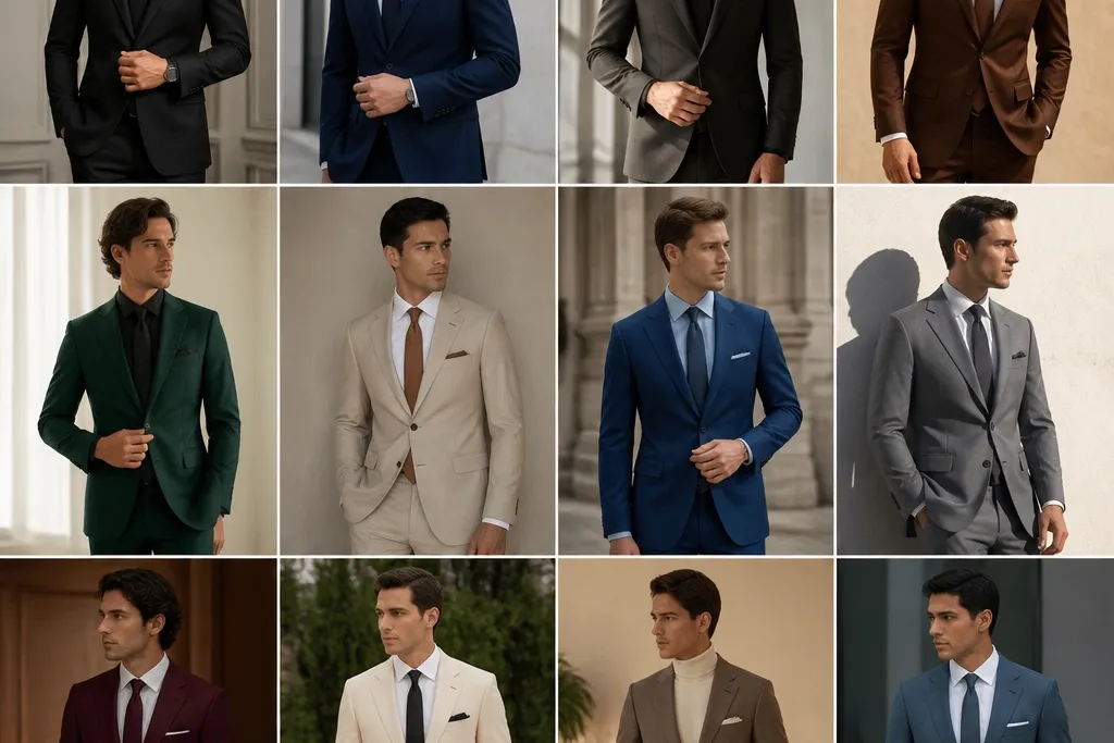
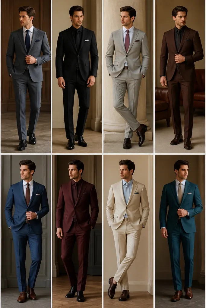
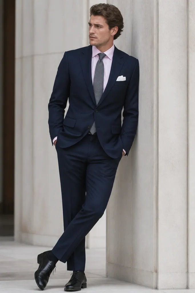
1. Navy Dress + Burgundy Tie + Black Shoes
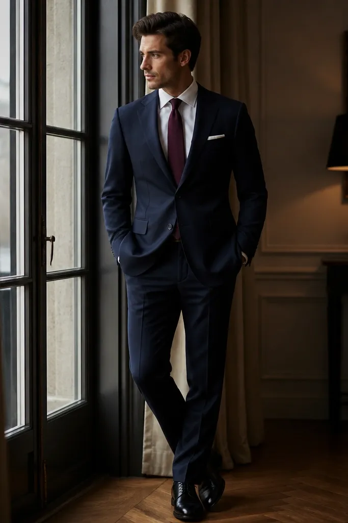
Navy is the safest formal base because it holds color depth without looking loud. Burgundy adds warmth and looks expensive against navy, especially with matte wool or a textured fabric. Black shoes finish the contrast cleanly and keep the outfit from drifting into "brown-ish" territory.
Choose a navy fabric that looks slightly dense - wool, ponte, or a structured suiting blend. Keep the tie matte, not glossy, so burgundy reads rich instead of shiny. For proportions, match the tie width to your lapel size - if your lapels are medium, go with a 3.25-3.5 inch tie width.
Pro tipUse a burgundy pocket square with a white edge or a white border so it doesn't blend into the tie.
AvoidAvoid burgundy satin ties with navy if your venue lighting is warm - the shine can look patchy.
2. Charcoal Dress + Sky Blue Shirt + Silver Accessories
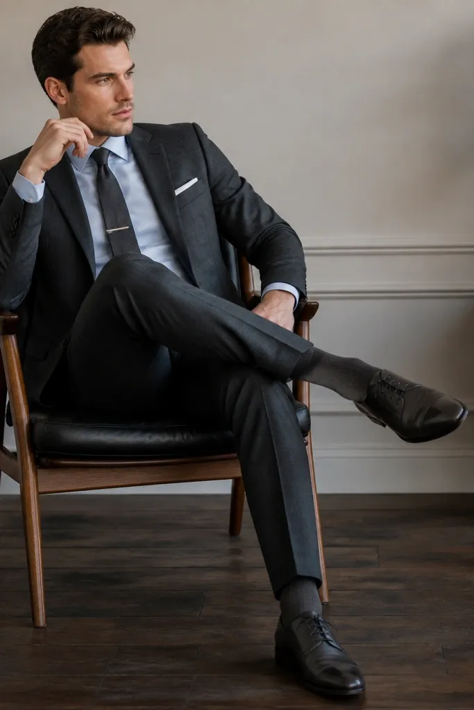
Charcoal is neutral but not flat. Sky blue gives you a crisp "fresh" look without turning into bright summer energy. Silver accessories - watch, tie clip, cufflinks - make the whole outfit feel colder and cleaner, which works especially well under fluorescent office lighting.
Pick a charcoal shade that is closer to deep gray than black. The sky blue should be light enough to show contrast but not so pale it looks washed - think powder blue. Keep your shoes in the gray-to-dark-gray family, not black, if you want a softer finish.
Pro tipIf your shirt has a subtle texture like micro-weave, charcoal + sky blue looks richer in photos.
AvoidSkip black shoes with charcoal if you want the outfit to feel sharp instead of heavy.
3. Forest Green Dress + Cream Shirt + Espresso Brown Belt
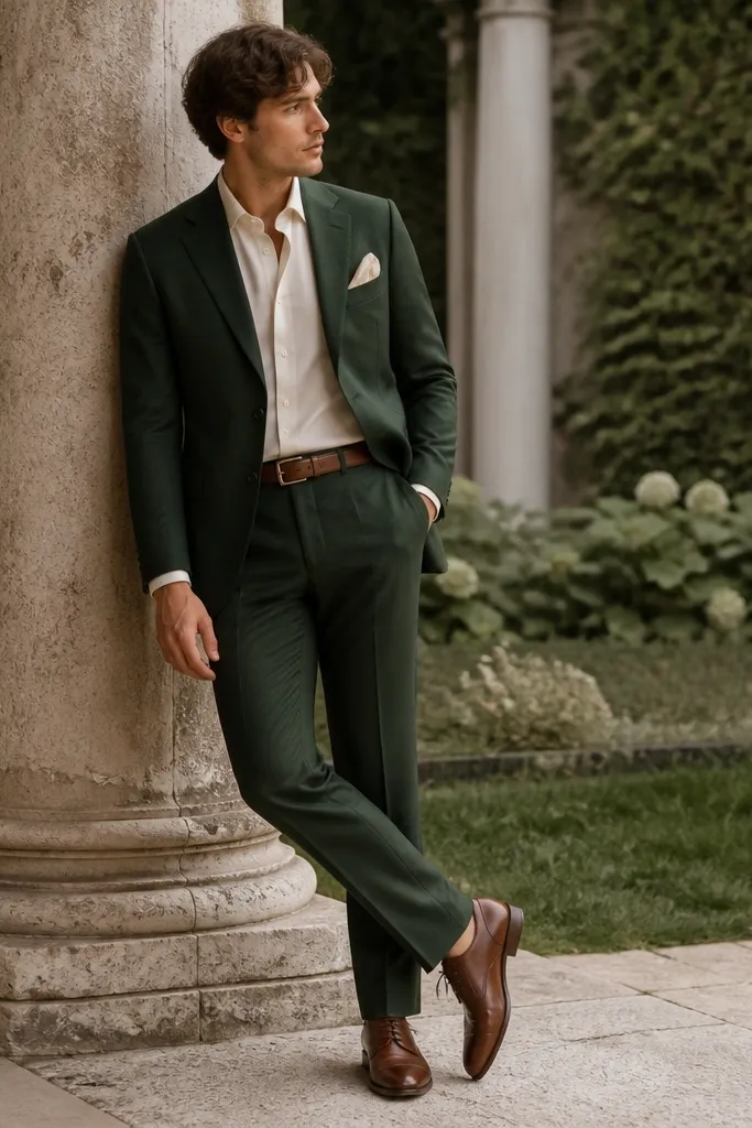
Forest green reads formal when it's deep and structured. Cream softens the color and makes green look intentional, not seasonal. Brown leather accessories add warmth and make the outfit feel grounded, especially if you're wearing a matte dress fabric.
Choose forest green with a slightly cool undertone, not yellow-green. Cream shirts look better than bright white here - it keeps the green from looking harsh. Match belt and shoes exactly in tone - espresso brown with espresso brown - then keep your tie, if you wear one, in a muted green or burgundy.
Pro tipTry a cream pocket square in cotton with a soft fold - crisp silk can look too shiny with green.
AvoidAvoid pairing forest green with bright white and black shoes; it often looks like two separate outfits.
4. Black Dress + White Shirt + Red Pocket Square
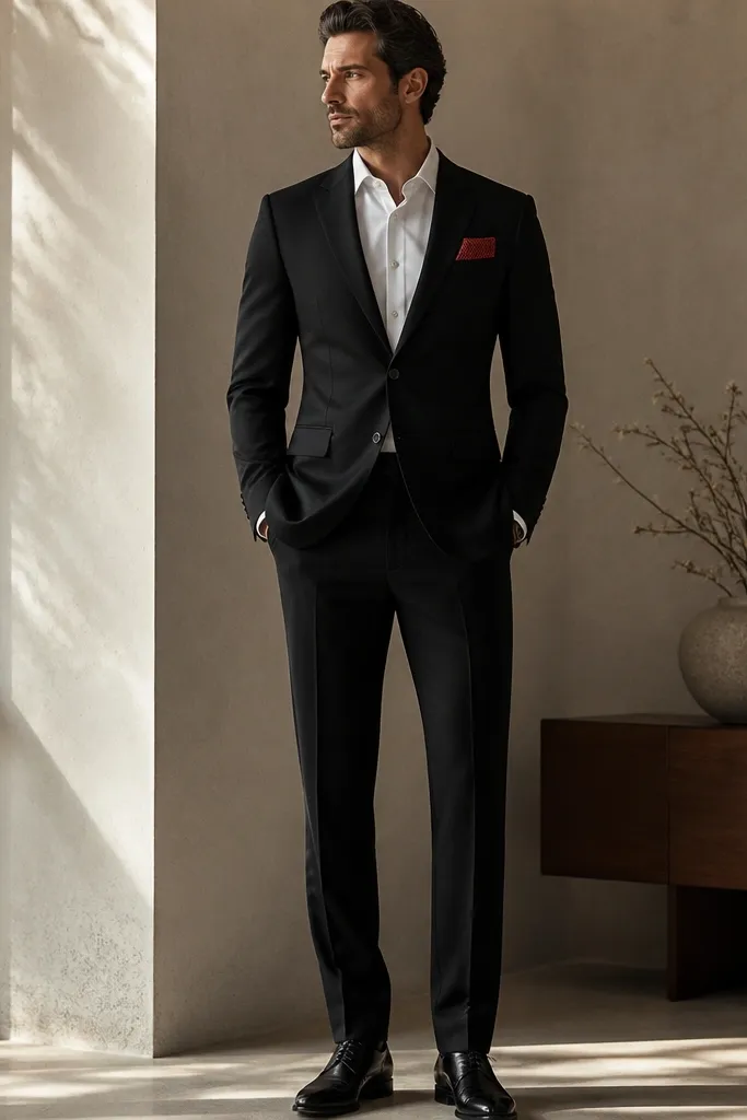
Black is dramatic, but a white shirt keeps it classic. Red as a single accent gives you a focal point without turning into a costume. This combo works because black absorbs light and the red pocket square catches it first.
Use a matte black dress fabric - wool, crepe, or a dense blend. Keep the red pocket square medium saturation (true red, not neon). If you're wearing a tie, go black or white - don't add another color.
Pro tipFold the pocket square so it shows 1-2 layers of red, not a thick block that looks bulky.
AvoidSkip a bright red tie with a black dress unless the event is very casual; it can overpower everything.
5. Deep Teal Dress + White Shirt + Navy Socks
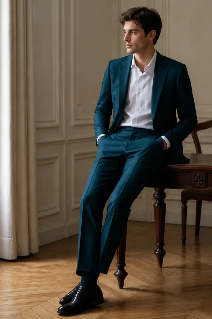
Deep teal is where people start getting compliments, because it looks more personal than basic navy. White keeps it sharp, and navy socks tie the outfit back to familiar formal colors. The teal reads rich when the fabric has a subtle sheen - like satin blend or a tightly woven finish.
Pick teal that looks like blue-green, not turquoise. If your dress fabric has shine, keep the shirt fully matte cotton. Use navy socks rather than black so the outfit has a soft transition at the ankle.
Pro tipMatch your belt to the shoes in darkness, then let teal and navy do the talking.
AvoidAvoid pairing teal with light tan shoes; it often looks beachy instead of formal.
6. Burgundy Dress + Black Shirt + Gold Watch
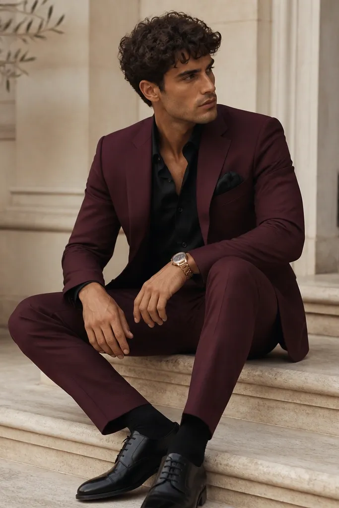
Burgundy on the body reads warm and confident, especially in velvet or brushed wool. A black shirt keeps the contrast sleek and prevents burgundy from looking too "sweet." Gold accents make it feel dressed-up without adding extra colors.
If your dress is burgundy, choose a black shirt that is matte (no shiny satin). Gold accessories should be warm gold, not silver-cool. Keep the pocket square in black or a very dark burgundy to avoid extra pops.
Pro tipButton the shirt all the way and use a slim watch face so the look stays sharp.
AvoidAvoid pairing burgundy with bright silver jewelry - it can make the burgundy look dull.
7. Light Gray Dress + Navy Tie + White Pocket Square
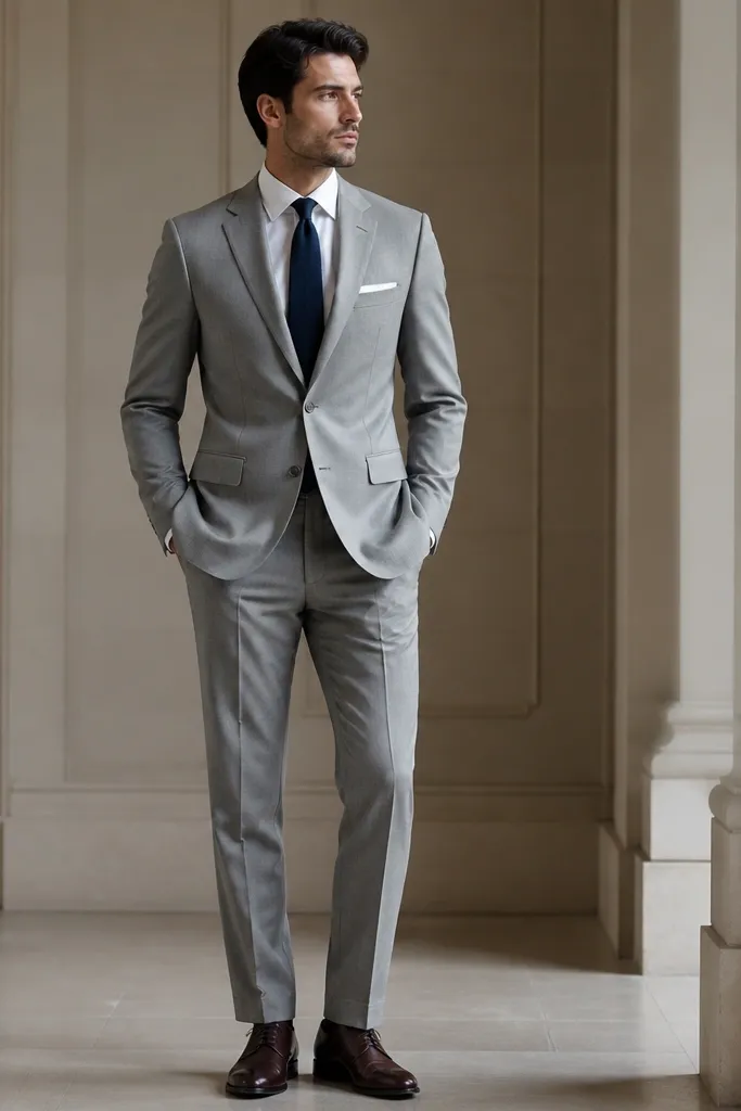
Light gray is tricky because it can wash you out in harsh lighting. Navy tie and white pocket square add crisp structure and keep the outfit high-contrast. Dark brown shoes soften the gray and keep it from looking like a corporate uniform.
Choose light gray with a cool base, not beige-gray. Navy tie should be medium depth, not ink-black. For fit, make sure the dress hem and sleeves don't bunch - light fabrics show bulk fast.
Pro tipUse a navy tie knot that sits tight, like a four-in-hand, so the tie doesn't hang loose against light gray.
AvoidAvoid pairing light gray with a pale blue tie; the two can blend into a flat look.
8. Oxblood Dress + Ivory Shirt + Tan Suede Shoes
Oxblood is red that reads mature. Ivory instead of bright white makes it feel softer and more expensive. Tan suede shoes add texture contrast - suede catches light differently than leather, so the outfit feels layered instead of monochrome.
Use oxblood in a fabric with body - wool or structured knit. Ivory should be creamy, not yellow-beige. Keep the pocket square plain white or ivory linen so it doesn't compete with the dress color.
Pro tipIf you wear tan suede, keep your belt in the same tan family or skip the belt and let the shirt tuck hold the look.
AvoidAvoid pairing oxblood with black shoes; the contrast is harsh and can look like a Halloween theme.
9. Sand Beige Dress + Chocolate Brown Tie + Matching Belt
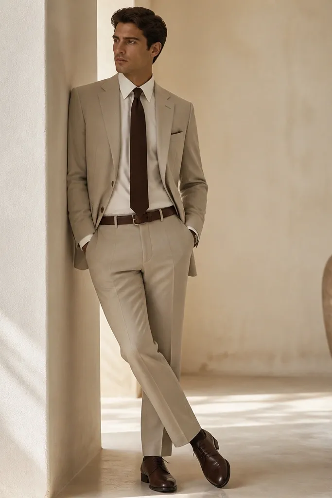
Sand beige is formal when it's tailored and not too pale. Chocolate brown gives depth and keeps the outfit from looking like casual chinos. Matching belt and shoes in the same chocolate shade makes the look feel intentional and pulled together.
Pick beige that leans warm but not yellow. Off-white shirt looks better than bright white because it keeps warmth consistent. If you're adding a pocket square, use a white linen with a faint fold - keep it simple.
Pro tipUse a tie with a subtle texture, like grenadine, so chocolate reads rich instead of flat.
AvoidSkip beige with black accessories; it can look mismatched and overly stark.
10. Royal Blue Dress + White Shirt + Red Socks
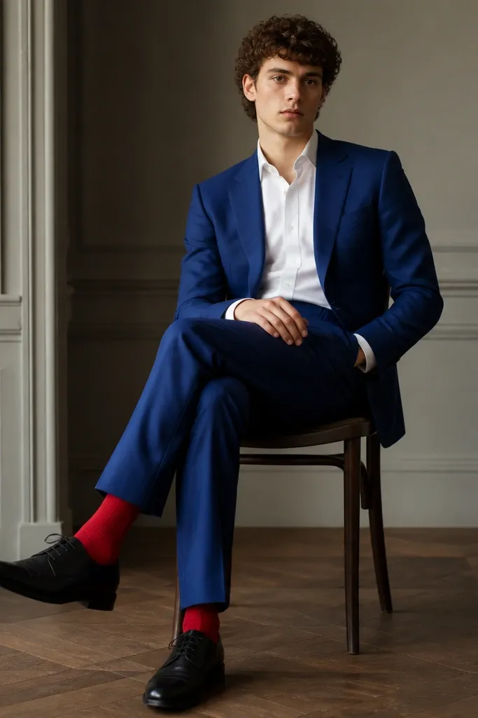
Royal blue is bold, but it looks classy when you keep everything else clean. White shirt is the reset button. Red socks are a sneaky accent - you don't see them until you move, so the outfit stays elegant until it surprises.
Choose royal blue with a saturated tone, not cornflower pale. Keep the dress fabric matte so the blue doesn't look neon. Red socks should be mid-depth - not bright clown red - and match your pocket square if you use one.
Pro tipIf you want this to look extra sharp, match sock color to the lining of your pocket square or tie, not to the shoes.
AvoidAvoid pairing royal blue with a red tie; the color hits too often and looks busy.
11. Navy Dress + Pale Pink Shirt + Gray Tie
Pale pink is a gentle contrast to navy that flatters a lot of skin tones. A gray tie keeps the palette sophisticated and prevents the pink from turning into a "spring" vibe. This works especially well if your dress fabric is smooth, because the colors stay controlled.
Use pale pink that's dusty, not bright. The gray tie should be medium shade, not charcoal-black, so it doesn't disappear into the navy. Keep the pocket square white and simple - one fold is enough.
Pro tipDo a quick check in hallway lighting: if the pink looks salmon, swap to a cooler pale pink shirt.
AvoidAvoid navy + bright hot pink; it reads loud in formal settings.
12. Cream Dress + Black Tie + Black Patent Shoes
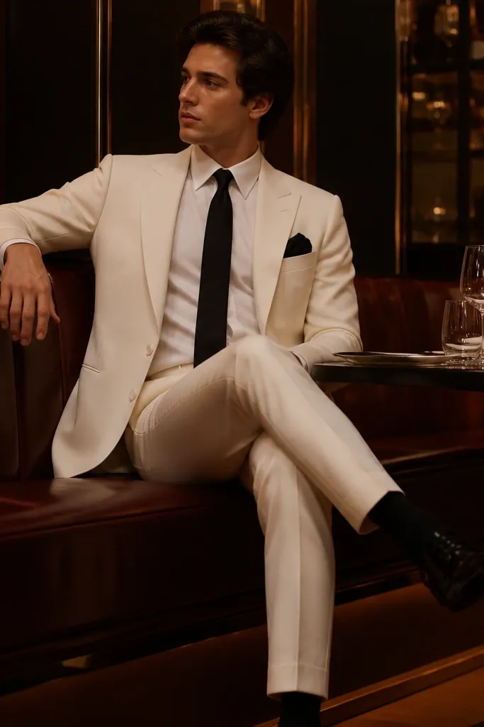
Cream dresses for men look sharp when the contrast is controlled. Black tie creates structure, and black patent shoes add a formal shine that matches the tie's depth. This combo works well for evening because the cream base reflects light softly.
If your cream dress is light, pick a black tie in matte silk or wool - not shiny. Patent shoes should be clean and mirror-smooth; scuffed patent looks cheap fast. Keep socks black so the ankle doesn't break the contrast.
Pro tipIron the cream fabric and check the seams - light colors show wrinkles instantly.
AvoidAvoid cream with brown shoes; it can look like a casual wedding guest outfit.